Your Website is Always a Work in Progress
Over the years, I’ve seen a lot of authors, bloggers and freelancers launch their websites.
They rarely start out with a massively, gorgeous site. They normally begin with something simple but workable: perhaps it’s a free blog on WordPress.com, for instance, or a single page on About.me.
The wonderful (and sometimes frustrating) thing about websites is that they’re always a work in progress.
You never truly “finish” a website. Even if you don’t have a blog or “news” section that needs new material on a regular basis, you’ll still want to make updates.
You’ll publish a new book. You’ll start – or stop – offering a particular service. You’ll change direction (perhaps quite radically). And your website will need to evolve with you.
Whatever stage you’re at with your own website, this is good news! You don’t need to get it “perfect” from day one.
But … you also don’t want to become so used to your current website that you never change a thing.
Here’s How the Aliventures Website Has Evolved Over the Years
While it’s a bit embarrassing to share some of these screenshots with you, I thought you might like a glimpse at how this very website has evolved since I first bought the domain name in 2008.
First Version of Aliventures (June? 2008)
Here’s how the very first version of the site looked:
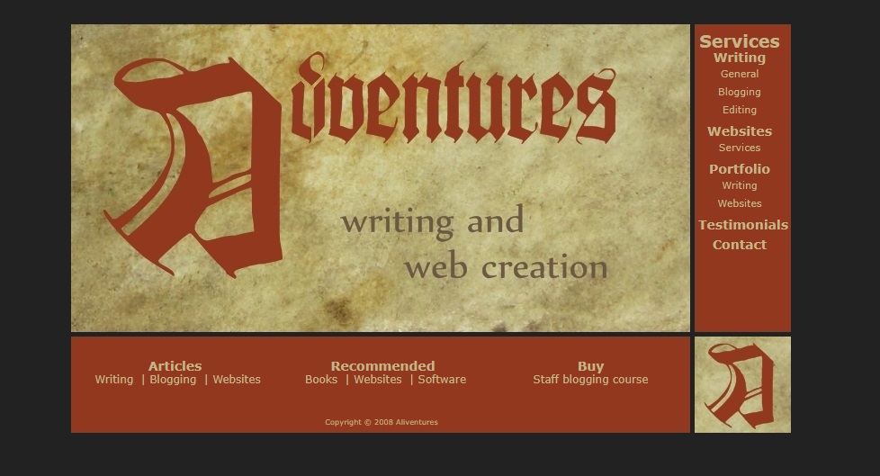
This was back in mid 2008. The site was hand-coded in HTML (I was already using self-hosted WordPress but for some reason thought I should design it myself…) and as you can see, looked completely different from today.
My husband (then boyfriend!) Paul did the logo. I’m not entirely sure now why I had a medieval vibe going on (though I was also writing a medieval-esque fantasy novel at the time).
It was, I presume, optimised for smaller screens than today too, as this is what it looks like on my wide screen monitor:
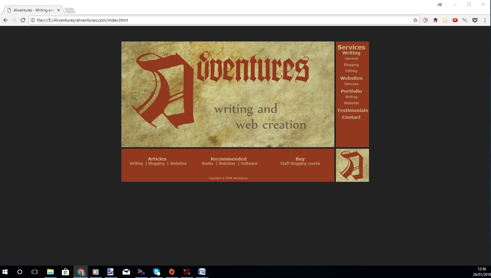
I cringe a bit when I look at it now, but it did its job! I had a home base on the web and I was bringing in clients.
Second Version of Aliventures (July 2009)
In July 2009, I changed the site completely. I went over to WordPress, using the Thesis theme and a bit of my own tweaking and kludging.
At the time, I was writing for several personal development / self-improvement type blogs, so that was the angle I went with for my own site.
Here’s what it looked like:
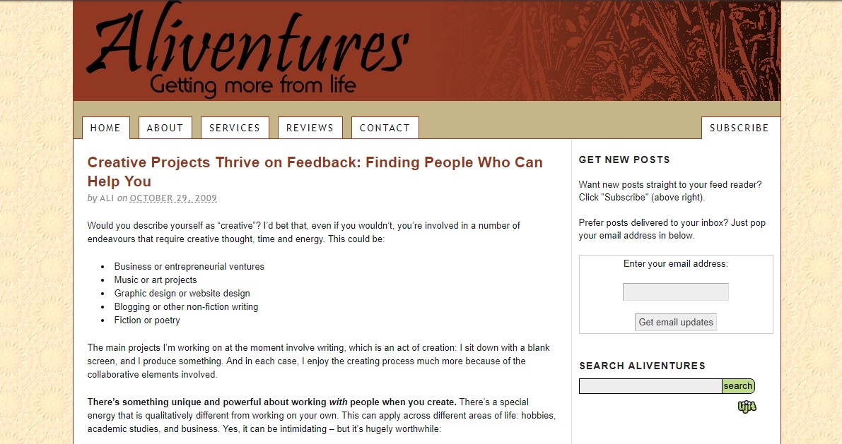
It was a couple of years before I realised that I was sick of writing about time management and personal development type topics, and that more and more of my focus was on writers and writing.
Third Version of Aliventures (November 2010)
In November 2010, I changed Aliventures to focus on writing, rather than on personal development topics.
I’d built up an audience of 1,600 subscribers at this point, and I remember being really anxious about what felt like a huge shift … but not one reader even mentioned it!
Here’s how that version of the site looked:
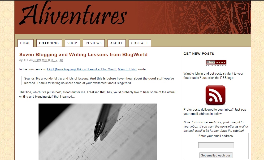
Again, it’s far from perfect. But I was bringing coaching work, and the blog was continuing to grow.
Fourth Version of Aliventures (December 2010)
As part of the refocus of my website, I also got a fresh design done. Here’s how it looked a month or so later.
Note the more professional logo/banner, the redesigned sidebar (though clearly I hadn’t figured out at this stage how to make the white background of my RSS logo transparent!) and the new background “wallpaper”.
This was also the point at which I started using images at the start of each blog post.
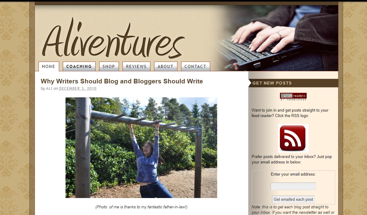
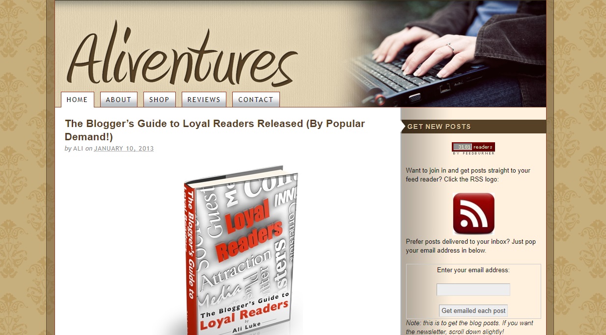
After that, my site stayed more or less the same for quite a while. I tweaked the sidebar every so often, adding things like my novel Lycopolis and my Blogger’s Guides, and in January 2013, when I went off on maternity leave, I’d removed the “Coaching” tab and reordered the menu:
If you have children of your own, you’ll know just how busy life is while they’re small. If you don’t, you can probably imagine! Not much happened with the website for a while, and I only posted infrequently during 2015, when we were in the middle of moving from Oxford to Leeds with a newborn and a two year old.
Fifth Version of Aliventures (2016 onwards)
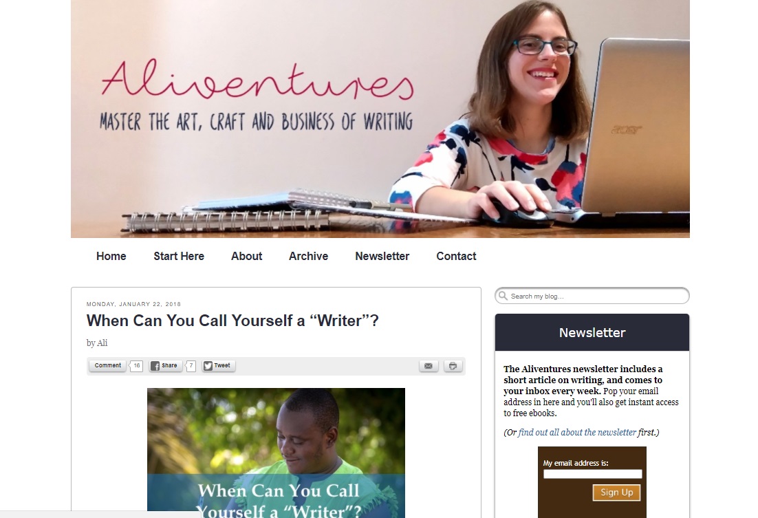
I was keen to get back to the blog, though, and I also wanted a new, more modern (and more responsive) design. If you’re reading this on the blog, rather than by email, the site you’re on looks pretty much the same as the one I launched at the beginning of 2016:
Of course, the nature of blogging is that this is far from the “final” Aliventures. I’m currently thinking about another redesign, probably using the Divi theme (which is what I use now over on Writers’ Huddle).
How Will Your Website Evolve?
Whether you have a “static” website (like Aliventures was in the early days), a blog, or a different type of web presence like a Facebook page … it’s never going to be entirely finished.
I realise that might sound like a slightly depressing thought, but the great thing is that your website (or blog, etc) can change and grow with you.
Occasionally, that might mean a whole new design. You don’t need to spend a fortune on this: there are lots of “premium” WordPress themes out there, many of them very good, in the $50 – $300 range. These often make it easy to customise things to suit you, in a way that free themes don’t.
Most of the time, improving your blog just means making small, incremental tweaks. Here on Aliventures, for instance, I’ve made changes to aspects of my site like the About page and the sidebar every few months. I’ve gone from just using an image at the start of each post to having a branded image (with the post title and Aliventures.com overlaid).
The key thing to remember, though, is that you definitely don’t need to shoot for perfection from day one! Instead, launch a “good enough” website, and set aside time every few months to make changes.
Blog Critiques: Find Out Exactly What YOUR Blog Needs (And What You’re Already Getting Right)
 Only available until Friday 9th February.
Are you struggling to know how best to take your blog forward? Book your blog critique today: I’ll let you know what you’re already doing well … and I’ll give you concrete, practical suggestions for tweaks you could make.
I’m only taking orders for blog critiques until Friday 9th February (though you have up to three months from payment to book yours in). You can find out all the details here.
About

I’m Ali Luke, and I live in Leeds in the UK with my husband and two children.
Aliventures is where I help you master the art, craft and business of writing.
Start Here
If you're new, welcome! These posts are good ones to start with:
Can You Call Yourself a “Writer” if You’re Not Currently Writing?
The Three Stages of Editing (and Nine Handy Do-it-Yourself Tips)
My Novels
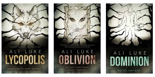
My contemporary fantasy trilogy is available from Amazon. The books follow on from one another, so read Lycopolis first.
You can buy them all from Amazon, or read them FREE in Kindle Unlimited.

This is so true…my blog looks nothing like it did when I started out. I’ve gone through four different free WordPress themes, and tried out tons more—and that’s just the beginning. I went from posting my novels (in their entirety—I didn’t try to publish) to adding more science content to slowly but surely migrating to posting just astronomy…then I actually moved over to an entirely different blog (and somehow expected my followers to come with me of their own accord—only maybe 5 did) and started posting about five different completely unrelated topics. And then I came back to my original blog, changed the domain name and title, stopped going by my pseudonym, and started posting on every science field imaginable. At the same time, I started up three other blogs to cover the other topics I’d written about on the previous blog (and they’re still active, I just never update). The one thing I’ve noticed evolve the most is the menu and what kinds of pages I use. Those two things have always been kind of representative of what’s going on with the blog as a whole.
Emma’s last blog post ..Distances Between Stars